Five things to look for in an Illustrator or Graphic Designer
Finding a top quality illustrator or designer is a challenge. It seems that everyone with a pirated or “student” copy of Adobe Creative Suite can illustrate or design what you need. If you don’t have a degree in art or design, how can you tell if they’ll be able to come up with what you need? Besides a stellar portfolio, a legal copy of their design software, and a trustworthy personality, you should look for these five things before you shake on things.
Can you find someone that would do the job well that doesn’t have these qualities? Most likely, but these are great signs that they care about what they do, are dedicated to their craft and strive to be their very best.
So… whether you need an artist to do some *deep breath* illustration for your kids book/album cover/instruction manual/kids bedroom/commercial real estate map/character design/info-graphic, or a designer to mock up a website/business card/logo/brochure/icon/app/event guide/annual report *catches breath* you should see if they have these things.
Warning(full disclosure): We are extremely biased, as we do all things… but hey… if you aren’t getting us then at the least make sure that whoever you get has some of these signs.
1. A sketchbook – The great artists and designers always have one on them or near them… and most famous designers will tell you they wished they drew more… yes more! You might think that sketching isn’t necessary for great design, but they go together like peanut butter and jam(or tea and toast for those with peanut allergies!). Being good at one helps the other, and they both flex creative muscles. A great designer should have notes and sketches of their ideas. The sketches don’t need to be mind altering, but they should show exploration of things like value, composition, proportion, and form.If you are hiring an illustrator check out their life drawing. Can they capture a gesture? Do they know anatomy? Do their faces drawn from life look like real faces or doll heads? Are they just copying other artist’s work? Life drawing is a great litmus test for how well an artist draws… if they can draw from life, that skill translates to everything they illustrate. Also if they don’t want to share their personal sketchbook with you… you have to wonder a) Are they confident enough to be able to take feedback when given to them? b) What kind of scandalous things are they drawing in there(answer… mostly bums!)? I’ve shared my personal sketchbook with most of my clients that care to ask… most times it’s just me practicing anatomy or working on my weak points… like a musician practicing their scales. Even if it’s personal pictures of family or friends, designers/illustrators shouldn’t worry. Its just a drawing, not a photograph. No one has thought that’s exactly how my partner’s armpit looks, or even that it belongs to her.
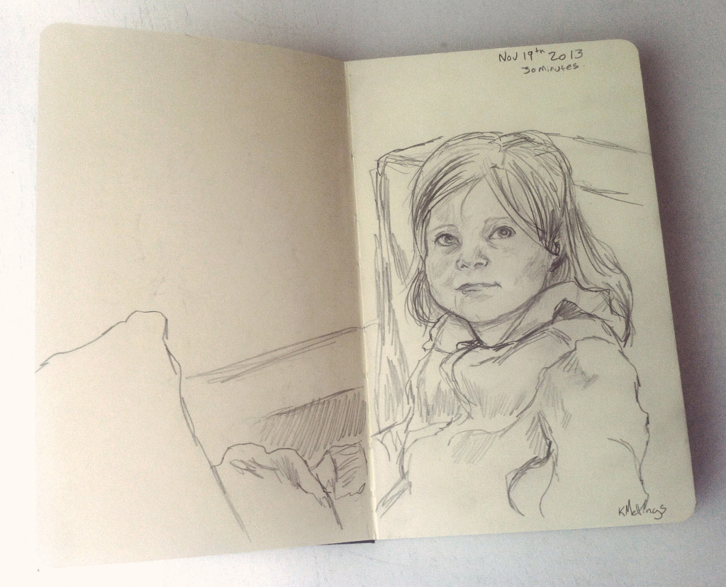
A page from my sketchbook. My daughter Verite was the model, I got her to sit still for a whole 30 minutes! LIfe drawing exercises all your art and design muscles.
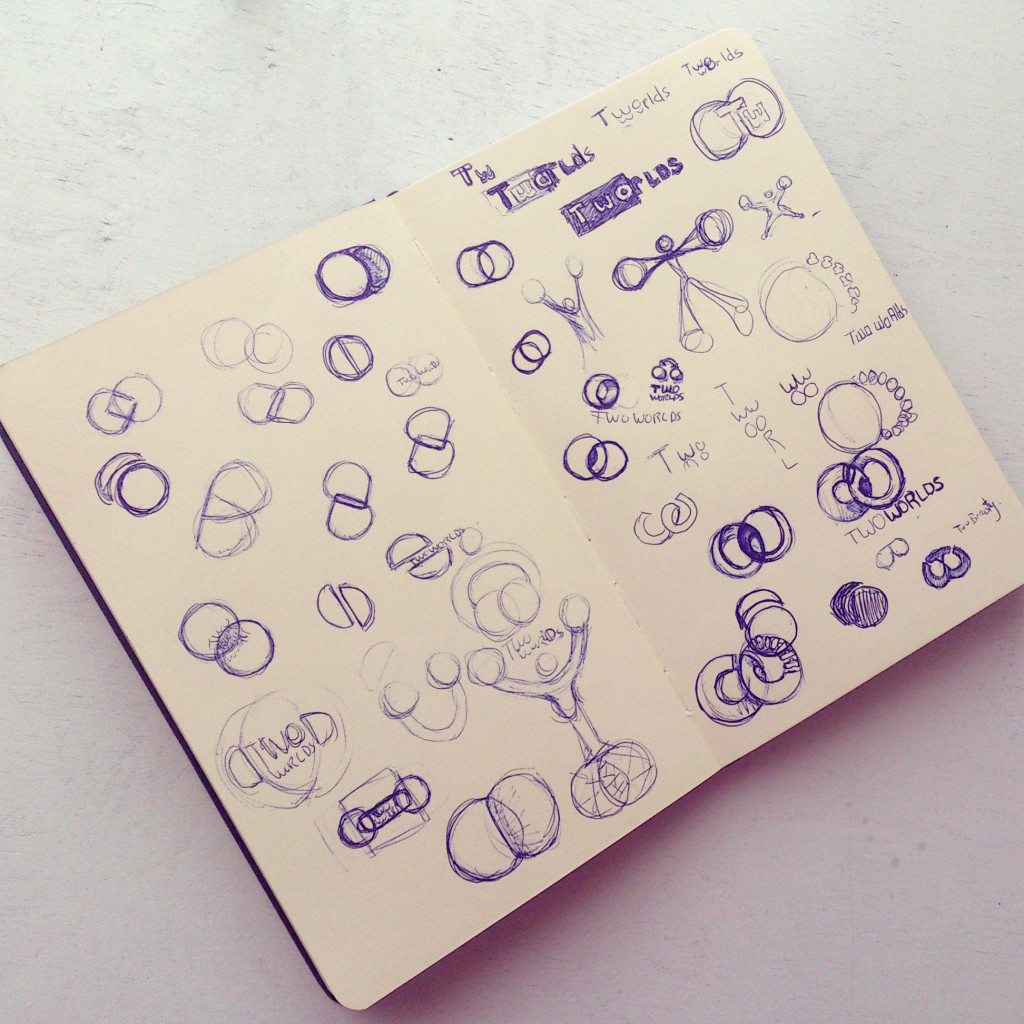
A page from Corey’s Sketchbook. Corey has a masterful mind for design. Here he explores some concepts for a client’s logo.
2. Personal work – Are the designers and illustrators you are hiring crazy enough to do work that doesn’t pay them? Are they creating illustration or design that is just for the love of it? Just as a great carpenter will make some pieces for his family or to try new techniques, so will an artist or designer make personal pieces. These creations help to either grow creatively in new directions, or to build creative muscles that aren’t utilized in everyday work. Our personal work usually explores more time consuming/painterly techniques, belying our classically trained background. Not too many people want or can afford this kind of style, but darn if it doesn’t make us giddy creatively, and darn if it doesn’t make all our other work that much better for honing our craft. Our personal work has also helped us with point number 3…
3. Awards – Awards don’t mean that your illustrator or designer is King-Dingaling. You can be an amazing artist and designer without this. We were great before we won awards (well Corey was, I was kind of rubbish)! What awards do mean, is that your designer/illustrator is striving to be the best. Creating work and putting it out there is scary, time consuming and expensive (entering these contests can cost hundreds of dollars each). Putting the work out there in this manner means that you are constantly striving, you are aware of what other people are doing in the industry and have an idea of how high the bar is set. Most clients aren’t worried if their designer is the best, but they do hope that they are trying to be recognized and produce work that stands with the best. So… awards are great (ahem, peek at ours) but they aren’t the be all and end all. Some of our favourite work has missed winning awards, and some work that we thought was good but not mind blowing has won. What matters is that we did our best and handed it in, with confidence that our work would stand up against the best. So ask your designer/artist if they read up on the annuals or participate in industry competitions. If they have, they show that they are striving for the best and willing to have their work held beside them. Winning is a nice bonus, but showing up to the game is what counts!
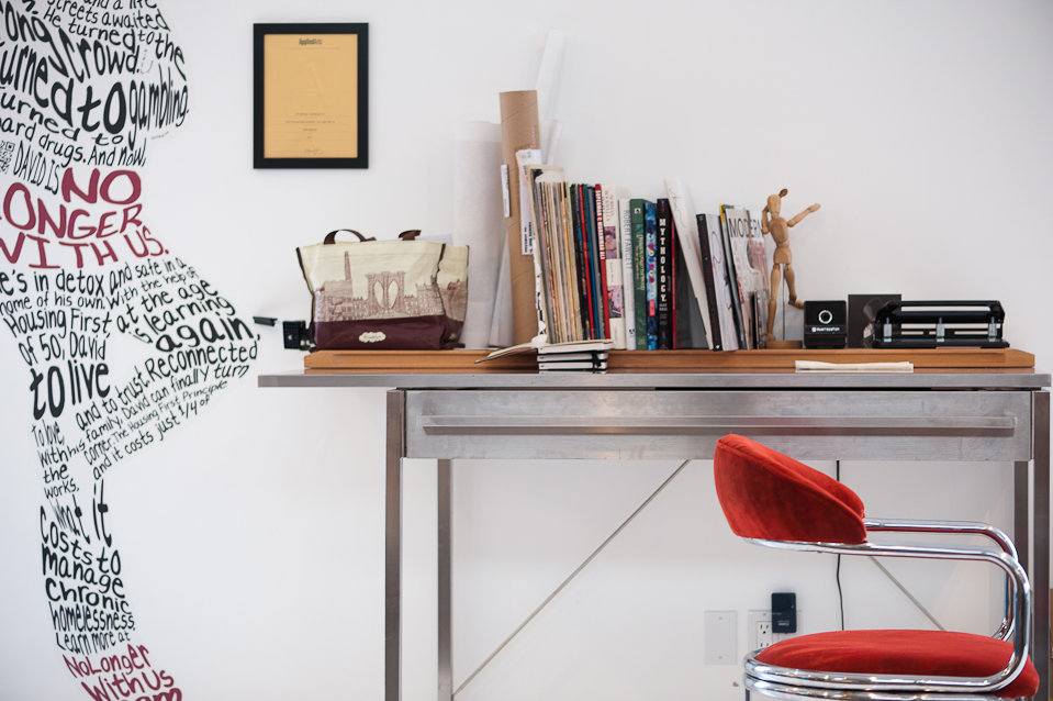
The natural media area of the studio. That yellow certificate is one of our applied arts awards for illustration. Photo by: Christy Dean Photography
4. Knowledge – We’ve read a bunch of these rectangular bound paper things, but in our day and age you don’t need these beautiful relics. Finding out who Leyendecker is and who he influenced artistically is a google search away now (as opposed to a year of hunting for an out of print book that was under 300 dollars like we did back in the day). If you are hiring an animator they should know about easing, squash and stretch and who the nine old men were( they are legends in animation history!).Knowing art and design history, like awards doesn’t necessarily make you better (though it certainly helps). Just as in politics, knowing past mistakes and successes can help you forge a way into the future. That knowledge should spill into other visual realms: theatre, book design, movies, video games… they all draw and build upon the same visual history and a shared vocabulary. Recognizing that art deco is the prevalent style used in the Great Gatsby movie, knowing why it was chosen, and what feelings, moods and visual tropes are identified with that can help inform the direction of a project, or steer a client away from a style that may have connotations they didn’t want with their product.Knowing the current state of art in galleries, or the lowbrow art movement may aid in reaching a niche target demographic with your design or illustrations. A keen sense of what has been before, as well as a great knowledge of what’s happening currently in the art and design world will help to steer the project’s visual identity in the right direction, not in the designer/artist’s favourite direction!

A small section of our art and design library…what’s that peeking behind the shelf..more awards? Shameless!!! Photo by: Christy Dean Photography
5. Understanding of IP(intellectual property) Law– A professional illustrator or designer should know about the legal ins and outs of your project. They don’t need to be a lawyer, but they do need to know if you need to purchase a licence for the “free” font you are using in your advertising. Most times errors and omissions fly under the radar, and many a young designer is saved by luck. If an error is caught and acted upon, it can be a huge cost to both the illustrator/designer and the client. We’ve heard lots of horror stories about logos being too similar to other companies, not purchasing proper licences, not looking at usage rights in stock, neglecting copyright searches, or not understanding what constitutes fair use. The professional you hire should be able to help navigate you through the legal waters, if not with absolute certainty, at the least with confidence and basic knowledge.
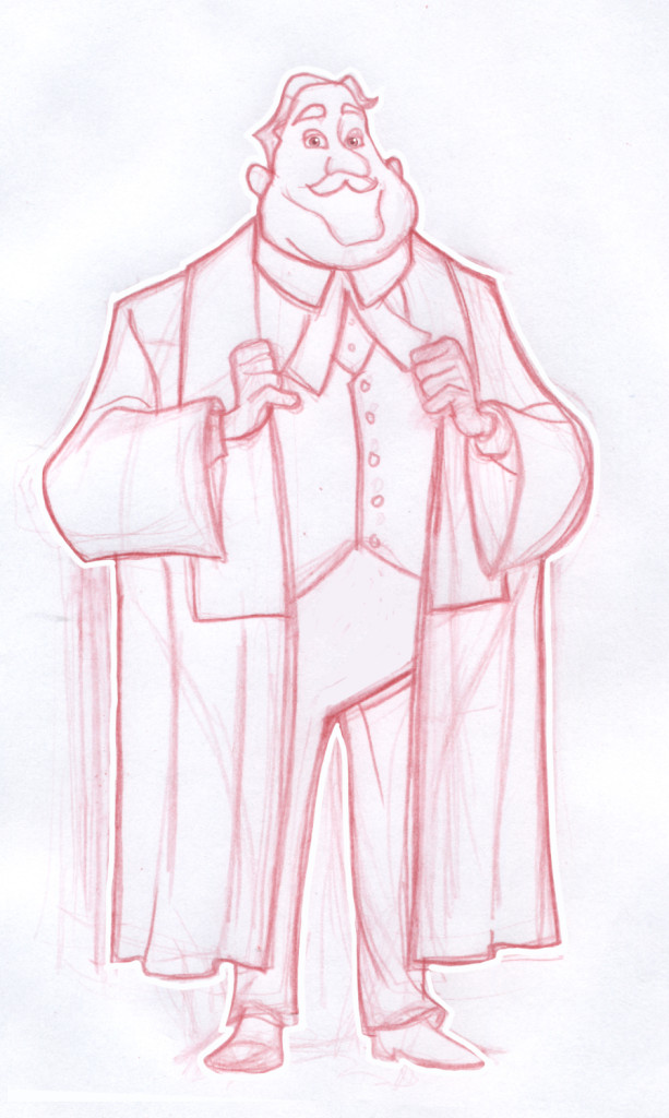
Here’s a law related sketch of a Judge we did for Red the Agency. This was for a series of children’s books for the Zebra Child Protection Centre.
Keep these five points front of mind when you are looking for an Illustrator or Designer, and it will help steer you in the right direction. Like any field, it’s relationships and dedication that count. These points will help determine if the creative person you are hiring is dedicated and wanting to push their craft/technique. It’s up to you to determine if they are the type of person that you want to build a relationship with. A great designer and illustrator can help communicate your company’s vision, mission and campaigns, so make sure that they can communicate with you first!



Recent Comments